WEDAP Demo
WEDAP : Weighted Ensemble Data Analysis and Plotting (pronounced we-dap)
![]()
Here, we will go through many examples of how to use the Python API or the command line for various types of plots using wedap and mdap.
Note that the CLI will tend to format and label more things for you, while the API starts as more of a “blank slate” format wise since the options can be more easily adjusted.
Before using the wedap API, make sure to import the following:
[1]:
import wedap
import matplotlib.pyplot as plt
[2]:
# optionally apply default wedap matplotlib style sheet
plt.style.use("default.mplstyle")
Basic WEDAP usages with WESTPA H5 data
Note that if the command line can generate the example plot, the shell command will be shown before the Python code. Also note that the command line arguments will all use a hyphen to separate multi-word arguments while in Python these will be represented by underscores, e.g. --data-type or --p-units as command line arguments will be equivalently in Python data_type or p_units.
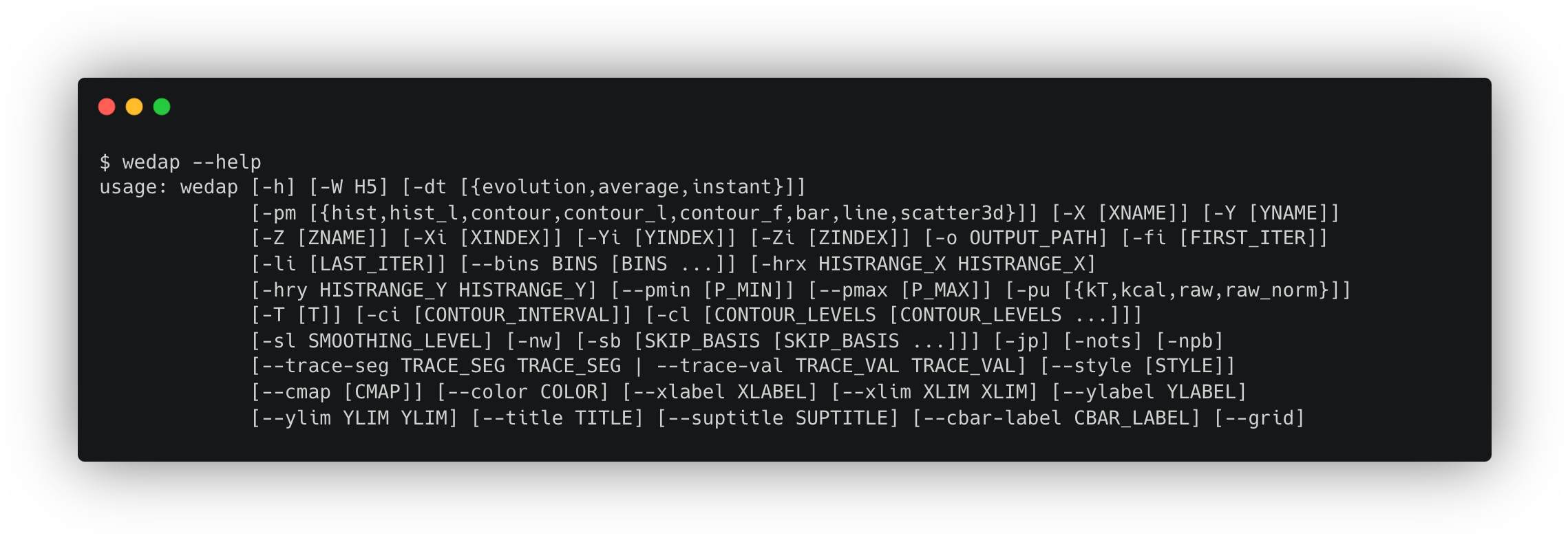
Running wedap -h or wedap --help on the command line is very useful for a summary of the command options, along with some basic usage examples.
To use the GUI, simply run wedap in the command line with no arguments and the popup should look something this:
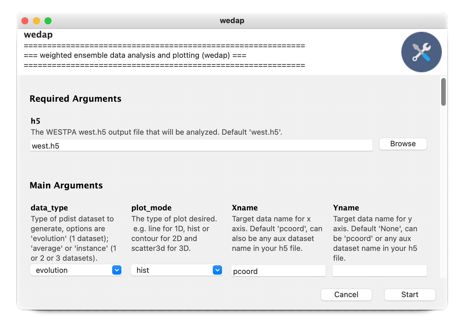
Reading through the GUI options and their associated descriptions can also be useful to find out more about them.
We note that wedap is compatible with multiple HDF5 data files passed into the -W or -h5 flag, which corresponds to passing a list instead of a string into the h5 argument in Python. For simplicity we only use a single file for our examples.
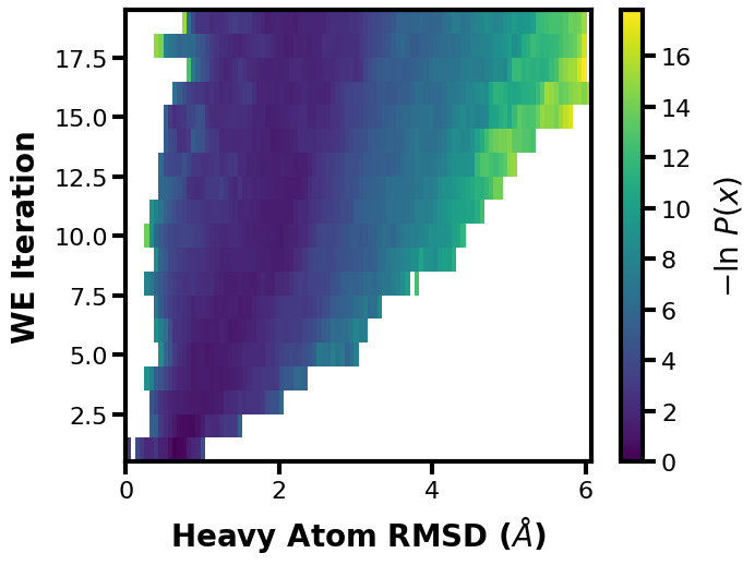
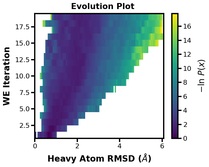
Example 1: Evolution Plot
This is a classic plot of the evolution of a WE simulation, plotting the probability distribution on the X axis as you progress through each iteration of the WE simulation on the Y axis. The colorbar is showing the probability values of each bin in the histogram. The probability values are derived from the raw data count values of the multiple segments in each WE iteration in the west.h5 file, weighted by each segment weight. This weighted histogram is normalized and shown on an inverted natural log scale: \(-\ln(\frac{P(x)}{P(max)})\)
$ wedap -W p53.h5 --data-type evolution --xlabel "Heavy Atom RMSD ($\AA$)"
[3]:
wedap.H5_Plot(h5="p53.h5", data_type="evolution").plot()
plt.xlabel("Heavy Atom RMSD ($\AA$)")
plt.ylabel("WE Iteration")
[3]:
Text(10.097222222222232, 0.5, 'WE Iteration')
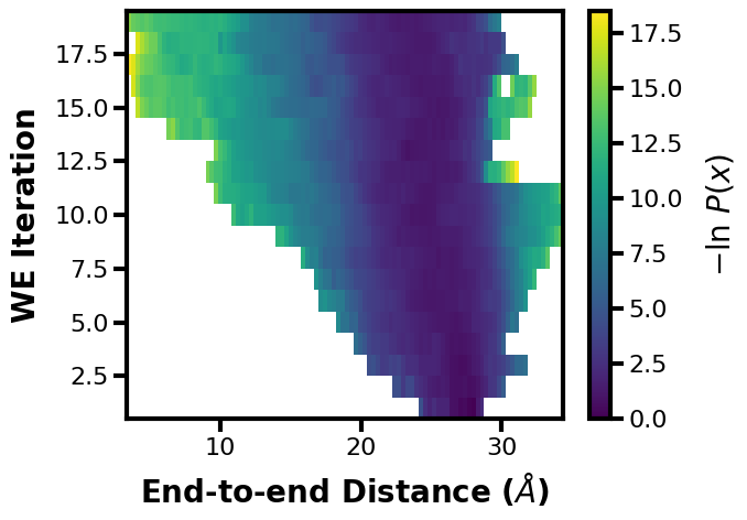
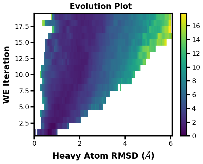
We could also just directly place the plot formatting arguments into wedap.H5_Plot(), we can also plot the other dimension of the progress coordinate by setting Xindex=1.
$ wedap -W p53.h5 --data-type evolution -X pcoord -Xi 1 --xlabel "End-to-end Distance ($\AA$)"
[4]:
wedap.H5_Plot(h5="p53.h5", data_type="evolution", Xname="pcoord", Xindex=1,
              xlabel="End-to-end Distance ($\AA$)", ylabel="WE Iteration").plot()
[4]:
(<Figure size 700x500 with 2 Axes>,
 <Axes: xlabel='End-to-end Distance ($\\AA$)', ylabel='WE Iteration'>)
Alternatively we can use the mpl object-based interface, this offers more flexibility when making more complex plots, examples of which will be demonstrated later along in this notebook.
[5]:
# instantiate the wedap H5_Plot class
wedap_obj = wedap.H5_Plot(h5="p53.h5", data_type="evolution")
# run the main plotting method
wedap_obj.plot()
# call the mpl axes object (ax) from wedap class object and format
wedap_obj.ax.set_xlabel("Heavy Atom RMSD ($\AA$)")
wedap_obj.ax.set_ylabel("WE Iteration")
# the fig object can also be called
wedap_obj.fig.suptitle("Evolution Plot", x=0.45, y=1.02)
[5]:
Text(0.45, 1.02, 'Evolution Plot')
We can break the process down further to access the data being passed:
[6]:
# run the wedap H5_Pdist class main method
X, Y, Z = wedap.H5_Pdist(h5="p53.h5", data_type="evolution").pdist()

# pass datasets to H5_Plot
wedap_obj = wedap.H5_Plot(X, Y, Z)
wedap_obj.plot()

# call the mpl axes object (ax) from wedap class object and format
wedap_obj.ax.set_xlabel("Heavy Atom RMSD ($\AA$)")
wedap_obj.ax.set_ylabel("WE Iteration")
# the fig object can also be called
wedap_obj.fig.suptitle("Evolution Plot", x=0.45, y=1.02)
[6]:
Text(0.45, 1.02, 'Evolution Plot')
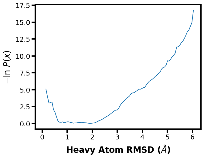
Example 2: 1D Probability Distribution
You can also make simple 1D plots for a single iteration --data-type instant || data_type='instant' or for the average of a range of iterations --data-type average || data_type='average'. Here we show the average probability distribution for the entire range of WE iterations in the input west.h5 file.
$ wedap -W p53.h5 -dt average --plot-mode line --xlabel "Heavy Atom RMSD ($\AA$)"
[7]:
wedap.H5_Plot(h5="p53.h5", data_type="average", plot_mode="line").plot()
plt.xlabel("Heavy Atom RMSD ($\AA$)")
[7]:
Text(0.5, 7.222222222222218, 'Heavy Atom RMSD ($\\AA$)')
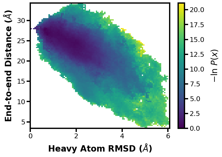
Example 3: 2D Probability Distribution
We can also make probability distributions using two datasets, first we can try this with just our two dimensional progress coordinates. Note that you can set the progress coordinate or any aux dataset index using Xindex, Yindex, and Zindex. This can be useful for multi-dimensional progress coordinates, but also for multi-dimensional auxiliary data.
$ wedap -W p53.h5 --xlabel "Heavy Atom RMSD ($\AA$)" -dt average  \
        -y pcoord -yi 1 --ylabel "End-to-end Distance ($\AA$)"
[8]:
wedap.H5_Plot(h5="p53.h5", data_type="average", Xindex=0, Yname="pcoord", Yindex=1).plot()
plt.xlabel("Heavy Atom RMSD ($\AA$)")
plt.ylabel("End-to-end Distance ($\AA$)")
[8]:
Text(31.347222222222232, 0.5, 'End-to-end Distance ($\\AA$)')
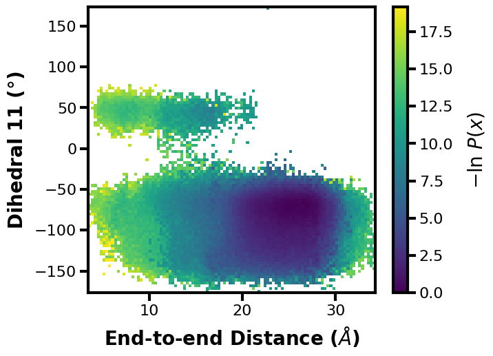
Now we can try it with one progress coordinate and an auxiliary dataset saved during the WE simulation (or it could have been calculated post-simulation (e.g. using w_crawl)):
$ wedap -W p53.h5 --xlabel "End-to-end Distance ($\AA$)" -xi 1 -dt average  \
        -y dihedral_11 --ylabel "Dihedral 11 ($\degree$)"
[9]:
wedap.H5_Plot(h5="p53.h5", data_type="average", Xindex=1, Yname="dihedral_11").plot()
plt.xlabel("End-to-end Distance ($\AA$)")
plt.ylabel("Dihedral 11 ($\degree$)")
[9]:
Text(-1.527777777777768, 0.5, 'Dihedral 11 ($\\degree$)')
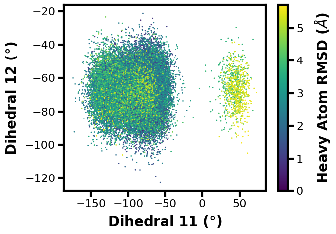
Example 4: 3D Scatter Plot
What if you don’t want to show the probability axis? Well, you can also just show how three different datasets are related in a 3D scatter plot. Here we can put two different aux datasets on the X and Y axes and we can set the colorbar to show the progress coordinate values in comparison:
$ wedap -W p53.h5 --xlabel "Dihedral 11 ($\degree$)" -x dihedral_11 -dt average -y dihedral_12 --ylabel "Dihedral 12 ($\degree$)" -z pcoord --cbar-label "Heavy Atom RMSD ($\AA$)" -pm scatter3d
[10]:
wedap.H5_Plot(h5="p53.h5", data_type="average", plot_mode="scatter3d",
              Xname="dihedral_11", Yname="dihedral_12", Zname="pcoord",
              cbar_label="Heavy Atom RMSD ($\AA$)",
              xlabel="Dihedral 11 ($\degree$)", ylabel="Dihedral 12 ($\degree$)").plot()
[10]:
(<Figure size 700x500 with 2 Axes>,
 <Axes: xlabel='Dihedral 11 ($\\degree$)', ylabel='Dihedral 12 ($\\degree$)'>)
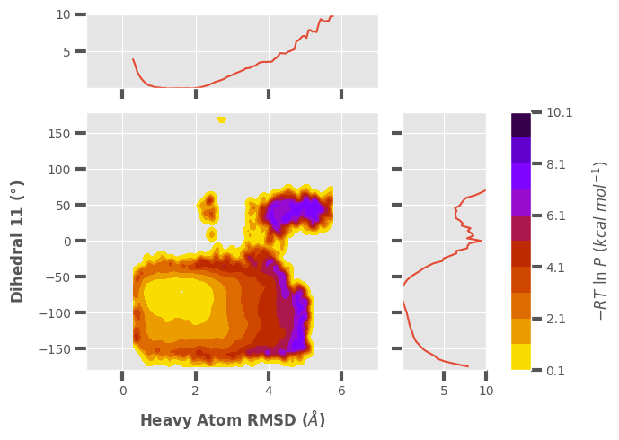
Example 5: Joint Plot with Multiple Extra Features
Here, I want to demonstrate some of the additional features available by making a more complicated joint plot. This is using a contour plot instead of a histogram, as set by --plot-mode contour || plot_mode='contour', there is also custom colormapping (--cmap), probability units (--p-units), iteration ranges (--first-iter, --last-iter), probability limits (--pmin, --pmax), plot style (--style), data smoothing (--smoothing-level), and plot limits
(--xlim, --ylim).
Available --plot-mode || plot_mode options:
line– plot 1D lines.hist– plot histogram (default).hist_l– plot histogram and contour lines.contour– plot contour levels and lines.contour_f– plot contour levels only.contour_l– plot contour lines only.scatter3d– plot 3 datasets in a scatter plot.
$ wedap -W p53.h5 --xlabel "Heavy Atom RMSD ($\AA$)" -xi 0 -dt average -y dihedral_11 --ylabel "Dihedral 11 ($\degree$)" --joint-plot -pm contour_f --cmap gnuplot_r --style ggplot --p-units kcal --first-iter 3 --last-iter 15 --pmin 1 --pmax 10 --smoothing-level 1 --xlim -1 7 --ylim -180 180
[11]:
# if there is alot of plotting choices, it can be easier to just put it all into a dictionary
plot_options = {"h5" : "p53.h5",
                "data_type" : "average",
                "plot_mode" : "contour_f",
                "Xname" : "pcoord",
                "Yname" : "dihedral_11",
                "cmap" : "gnuplot_r",
                "jointplot" : True,
                "p_units" : "kcal",
                "first_iter" : 3,
                "last_iter" : 15,
                "p_min" : 0.1,
                "p_max" : 10,
                "smoothing_level" :1,
                # the input plot_options kwarg dict is also parsed for matplotlib formatting keywords
                "xlabel" : "Heavy Atom RMSD ($\AA$)",
                "ylabel" : "Dihedral 11 ($\degree$)",
                "xlim" : (-1, 7),
                "ylim" : (-180, 180),
                }
plt.style.use("ggplot")
wedap.H5_Plot(**plot_options).plot()

# save the resulting figure
plt.tight_layout()
plt.savefig("wedap_jp.pdf")
[12]:
# change style back to wedap default
import matplotlib as mpl
mpl.rcParams.update(mpl.rcParamsDefault)
plt.style.use("default.mplstyle")
MDAP: plotting directly from standard MD data
MDAP : Molecular dynamics Data Analysis and Plotting (pronounced em-dap)
Similarly to wedap, running mdap -h or mdap --help on the command line is very useful for a summary of the command options, along with some basic usage examples. To use the GUI, simply run mdap in the command line with no arguments.
The input data from standard MD simulations must be in >=2 column format: use hash symbols (#) at top of data file to indicate comments (skipped lines)
COL1:Frame | COL2:Data | COL3:Data...
This data can be output from anywhere, but just as long as it’s formatted as a text, numpy binary (.npy), or pickle (.pkl) file, it can be read into mdap.
[13]:
import mdap
import matplotlib.pyplot as plt
[14]:
# optionally apply default wedap matplotlib style sheet
plt.style.use("default.mplstyle")
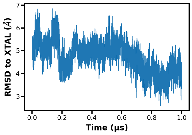
Example 1: 1D Timeseries
The first plotting example shows a standard 1D timeseries plot for any input dataset, where the dataset or quantity of interest on the Y axis varies over time on the X axis. The --timescale flag is optional to convert the frame numbers to a specific timescale depending on the time interval that the data was saved.
$ mdap -x rms_bb_xtal.dat --ylabel "RMSD to XTAL ($\AA$)" --plot-mode line --data-type time --timescale 10e4 --xlabel "Time (µs)"
[15]:
mdap.MD_Plot(plot_mode="line", data_type="time", Xname=["rms_bb_xtal.dat"],
             timescale=10e4, xlabel="Time (µs)", ylabel="RMSD to XTAL ($\AA$)").plot()
plt.show()
Example 2: 1D Probability Distribution
We can make the same 1D line plot of the probability from any input data file. Note that if you have multiple replicates that you want to plot together, you can just include more data files after the X axis data input flag (-X or --Xname file1.txt file2.txt ... and in Python you can input a list of file names into mdap.MD_Pdist(Xname=[])). Here, I am including just one file for the examples.
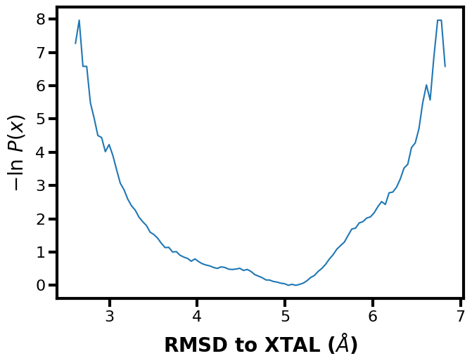
$ mdap -x rms_bb_xtal.dat --xlabel "RMSD to XTAL ($\AA$)" -pm line
[16]:
mdap.MD_Plot(plot_mode="line", Xname=["rms_bb_xtal.dat"], data_type="pdist").plot()
plt.xlabel("RMSD to XTAL ($\AA$)")
plt.show()
Example 3: 2D Probability Distribution
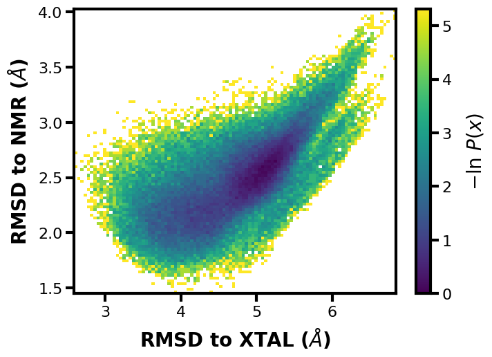
Again, if we include another dataset for the Y axis, a 2D probability distribution can be plotted.
$ mdap -x rms_bb_xtal.dat -y rms_bb_nmr.dat --xlabel "RMSD to XTAL ($\AA$)" --ylabel "RMSD to NMR ($\AA$)"
[17]:
mdap.MD_Plot(Xname=["rms_bb_xtal.dat"], Yname=["rms_bb_nmr.dat"], data_type="pdist").plot()
plt.xlabel("RMSD to XTAL ($\AA$)")
plt.ylabel("RMSD to NMR ($\AA$)")
plt.show()
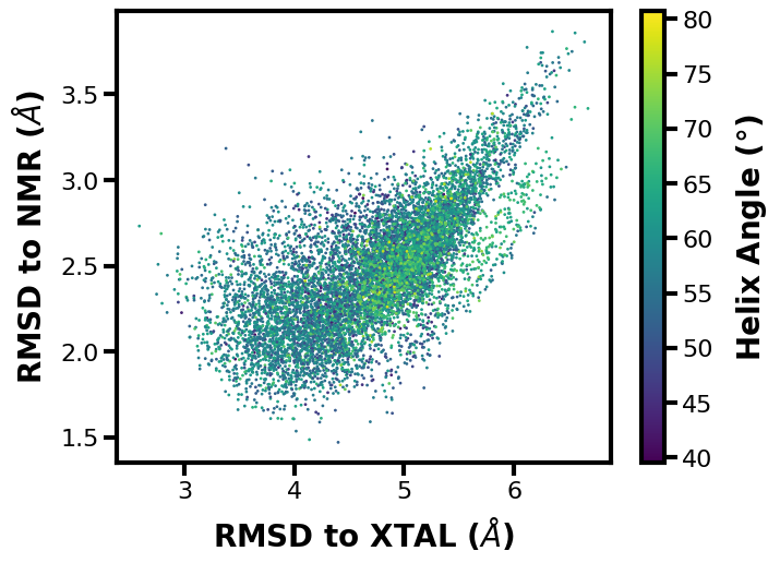
Example 4: 3D Scatter Plot
Next, a scatter plot using 3 input datasets and notice how we can use a numpy binary file as input (.npy):
$ mdap -x rms_bb_xtal.dat -y rms_bb_nmr.dat --xlabel "RMSD to XTAL ($\AA$)" --ylabel "RMSD to NMR ($\AA$)" -z c_angle.npy --cbar-label "Helix Angle ($\degree$)" -pm scatter3d
[18]:
mdap.MD_Plot(Xname=["rms_bb_xtal.dat"], Yname=["rms_bb_nmr.dat"], Zname=["c_angle.npy"],
             data_type="pdist", cbar_label="Helix Angle ($\degree$)", plot_mode="scatter3d").plot()
plt.xlabel("RMSD to XTAL ($\AA$)")
plt.ylabel("RMSD to NMR ($\AA$)")
plt.show()
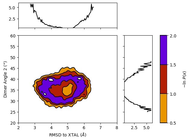
Example 5: Joint Plot with Extra Features
For the last example in the mdap set, we can again demonsrate a variety of extra features, many of which are the same as with wedap. Something that is unique with mdap is that you can set --Xinterval || MD_Plot.Xinterval to apply to X Y or Z data (changing X to Y or Z in the arguments). This can adjust the size of your datasets if there is a mismatch (e.g. if you saved one dataset every 10 frames and the other every single frame). We can also see here that the
--contour-interval or -ci argument was used, which sets the interval of each contour level. The Y axis data is also being indexed to position 2, so if the input dataset has multiple columns they can all be accessed like this. Finally we set the --style argument to None, which sets everything back to the matplotlib plotting defaults.
$ mdap -x rms_bb_xtal.dat -y o_angle12.dat --xlabel "RMSD to XTAL ($\AA$)" --ylabel "Dimer Angle 2 ($\degree$)" --Yindex 2 --Xinterval 10 -pm contour --color k --style None --p-units kT --contour-interval 0.5 --smoothing-level 2 --cmap gnuplot_r -jp --xlim 2 8 --ylim 20 60 --pmin 0.5
[19]:
# change to mpl default plotting settings
import matplotlib as mpl
mpl.rcParams.update(mpl.rcParamsDefault)
[20]:
plot = mdap.MD_Plot(Xname=["rms_bb_xtal.dat"], Yname=["o_angle12.dat"], Yindex=2, color="k", p_min=0.5,
                    contour_interval=0.5, smoothing_level=2, cmap="gnuplot_r", jointplot=True,
                    data_type="pdist", Xinterval=10, plot_mode="contour", p_units="kT",
                    xlabel="RMSD to XTAL ($\AA$)", ylabel="Dimer Angle 2 ($\degree$)", xlim=(2, 8), ylim=(20, 60))
plot.plot()

# save the resulting figure
plt.tight_layout()
plt.savefig("mdap_jp.pdf")
plt.show()
/Users/darian/github/wedap/wedap/h5_plot.py:288: UserWarning: With 'contour' plot_type, p_max should be set. Otherwise max Z is used.
  warn("With 'contour' plot_type, p_max should be set. Otherwise max Z is used.")
[21]:
# optionally apply default wedap matplotlib style sheet
plt.style.use("default.mplstyle")
Advanced wedap examples
Example 1: Multi-panel Probability Distributions
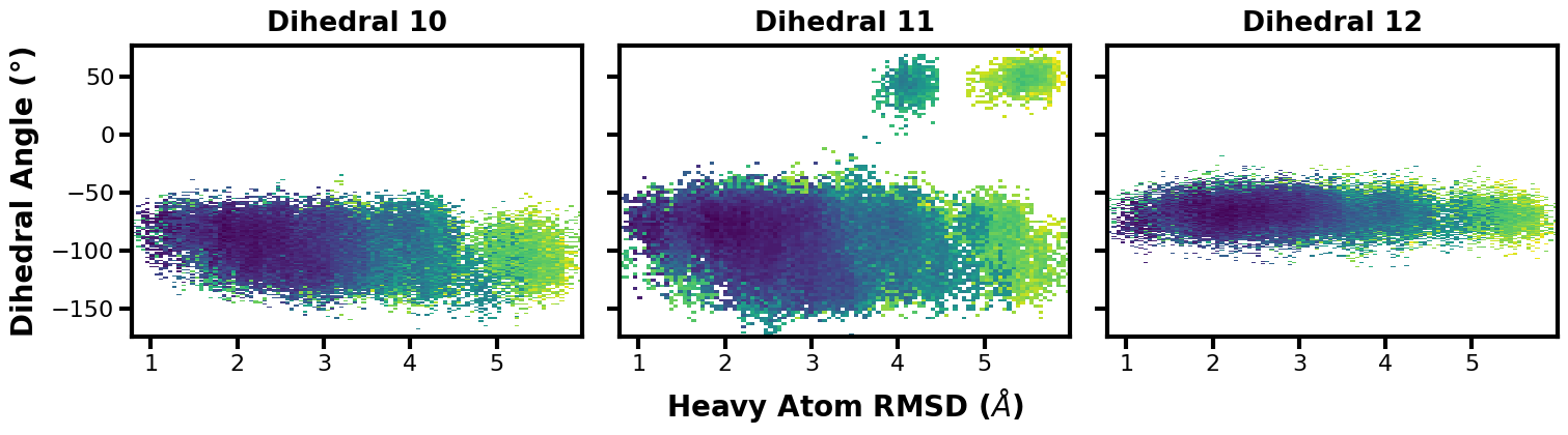
Here, we can make a plot showcasing multiple aux datasets and how they relate to the progress coordinate.
[22]:
fig, axs = plt.subplots(ncols=3, nrows=1, sharex=True, sharey=True, figsize=(15,4))

for i, ax in enumerate(axs):
    wedap.H5_Plot(h5="p53.h5", data_type="instant", ax=ax,
                  Xname="pcoord", Yname=f"dihedral_{i+10}").plot(cbar=False)
    ax.set_title(f"Dihedral {i+10}")

axs[1].set_xlabel("Heavy Atom RMSD ($\AA$)")
axs[0].set_ylabel("Dihedral Angle (°)")
plt.show()
[23]:
# save the resulting figure
fig.tight_layout()
fig.savefig("multi-panel-aux.pdf")
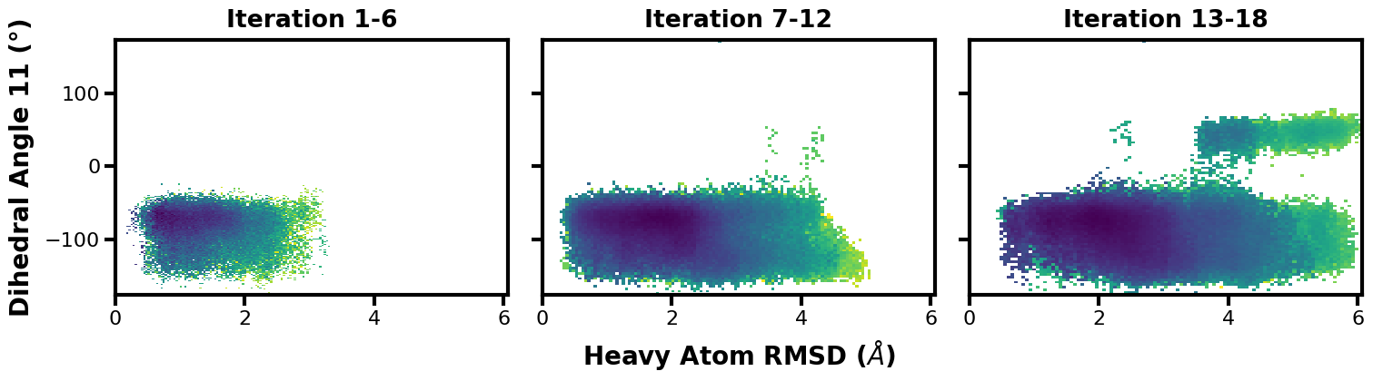
Since dihedral 11 looks interesting, we can make another multi-panel plot to showcase the time evolution.
[24]:
fig, axs = plt.subplots(ncols=3, nrows=1, sharex=True, sharey=True, figsize=(15,4))

i = 1
for ax in axs:
    wedap.H5_Plot(h5="p53.h5", data_type="average", ax=ax, first_iter=i, last_iter=i+6,
                  Xname="pcoord", Yname="dihedral_11").plot(cbar=False)
    ax.set_title(f"Iteration {i}-{i+5}")
    i += 6

axs[1].set_xlabel("Heavy Atom RMSD ($\AA$)")
axs[0].set_ylabel("Dihedral Angle 11 (°)")
plt.show()
[25]:
# save the resulting figure
fig.tight_layout()
fig.savefig("multi-panel-iters.pdf")
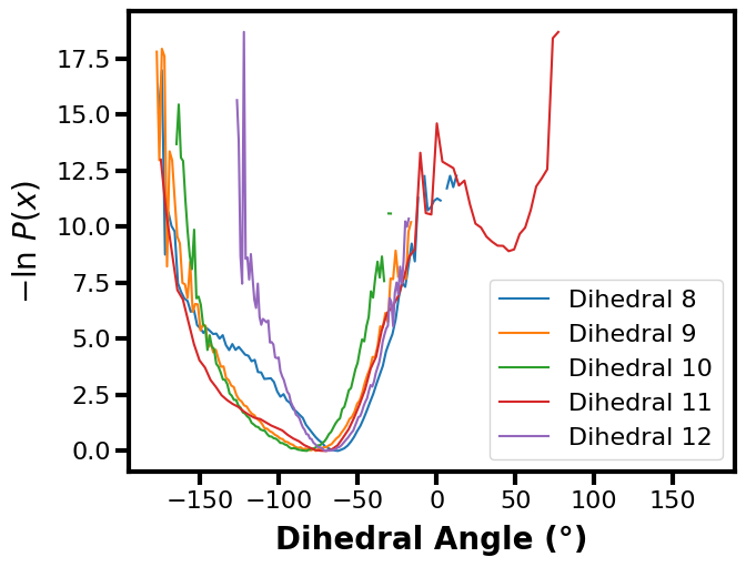
Example 2: Multiple Datasets on One Plot
We can also directly compare multiple aux or pcoord datasets on a single axis.
[26]:
fig, ax = plt.subplots()

for i in range(8, 13):
    wedap.H5_Plot(h5="p53.h5", data_type="average", ax=ax, plot_mode="line",
                  Xname=f"dihedral_{i}", data_label=f"Dihedral {i}").plot()

ax.set_xlabel("Dihedral Angle (°)")
plt.legend()
plt.show()
[27]:
# save the resulting figure
fig.tight_layout()
fig.savefig("multi-aux-1d.pdf")
If we wanted to, mdap could then be used to compare standard MD data to WE data.
[28]:
import mdap

fig, ax = plt.subplots()

for i in range(8, 13):
    wedap.H5_Plot(h5="p53.h5", data_type="average", ax=ax, plot_mode="line",
                  Xname=f"dihedral_{i}", data_label=f"Dihedral {i}").plot()

# extra line needed to also plot the standard MD distribution data
mdap.MD_Plot(Xname="c_angle.dat", data_type="pdist", plot_mode="line",
             data_label="From MD", ax=ax).plot()

ax.set_xlabel("Dihedral Angle (°)")
plt.legend()
plt.show()
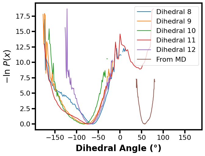
But keep in mind that this example doesn’t make too much sense because the datasets between standard MD and WE are for different systems and metrics. Ideally, you could use this framework to compare the same calculation for the same system to see how (hopefully) the WE simulation was able to explore the landscape better than standard MD.
[29]:
# save the resulting figure
fig.tight_layout()
fig.savefig("multi-aux-1d-w-md.pdf")
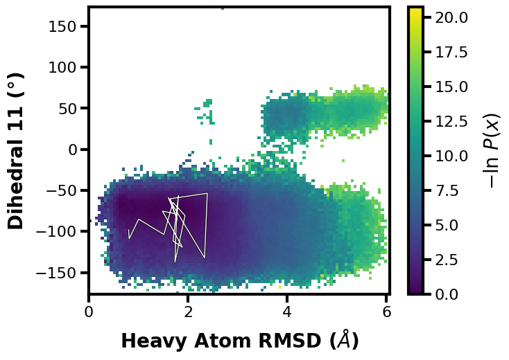
Example 3: Tracing Trajectories
We often want to see how a single continuous trajectory evolves as the WE simulation progresses.
If we want to trace the path to get to iteration 18 and segment 1:
$ wedap -W p53.h5 --xlabel "Heavy Atom RMSD ($\AA$)" -dt average  \
        -y dihedral_11 --ylabel "Dihedral 11 ($\degree$)" --trace-seg 18 1
[30]:
wedap_obj = wedap.H5_Plot(h5="p53.h5", data_type="average", Xindex=0, Yname="dihedral_11")
wedap_obj.plot()
wedap_obj.plot_trace((18,1), ax=wedap_obj.ax)
plt.xlabel("Heavy Atom RMSD ($\AA$)")
plt.ylabel("Dihedral 11 ($\degree$)")
plt.show()
[53]:
# save the resulting figure
wedap_obj.fig.tight_layout()
wedap_obj.fig.savefig("trace-seg.pdf")
Or we can trace by values, let’s say we want to find a walker that goes to a pcoord value of 5.8 and an aux value of 50:
$ wedap -W p53.h5 --xlabel "Heavy Atom RMSD ($\AA$)" -dt average  \
        -y dihedral_11 --ylabel "Dihedral 11 ($\degree$)" --trace-val 5.8 50
[33]:
wedap_obj = wedap.H5_Plot(h5="p53.h5", data_type="average", Xindex=0, Yname="dihedral_11")
wedap_obj.plot()
wedap_obj.plot_trace((5.8, 50), ax=wedap_obj.ax, find_iter_seg=True)
plt.xlabel("Heavy Atom RMSD ($\AA$)")
plt.ylabel("Dihedral 11 ($\degree$)")
plt.show()
Tracing ITERATION: 19, SEGMENT: 331
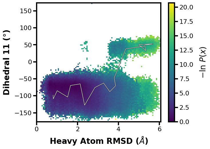
We also get an output line of which iteration and segment the trace corresponds to.
[34]:
# save the resulting figure
wedap_obj.fig.tight_layout()
wedap_obj.fig.savefig("trace-val.pdf")
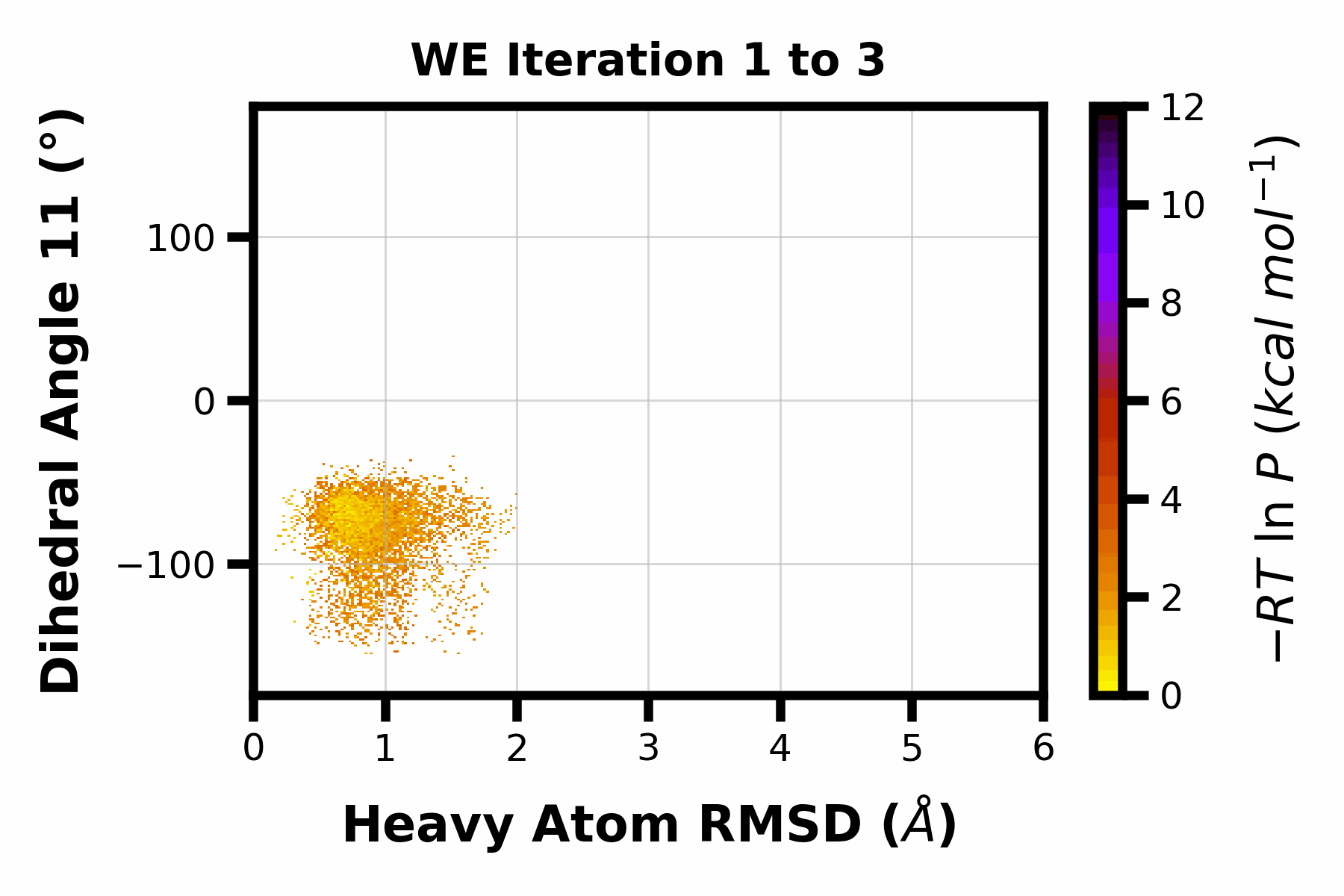
Example 4: Making a GIF
Let’s now make a GIF of our data, here I am using the dihedral 11 aux dataset and looping through the averages of small sets of iteration ranges, but anything could be looped to make the GIF using this example as a template.
$ wedap -h5 p53.h5 -y dihedral_11 -dt average --pmax 12 -pu kcal -li 19 --avg-plus 2 --gif-out example.gif --xlim 0 6 --ylim -180 180 --grid --cmap gnuplot_r --ylabel "Dihedral Angle 11 (°)" --xlabel "Heavy Atom RMSD ($\AA$)"
[2]:
plot_options = {"h5" : "p53.h5",
                "Xname" : "pcoord",
                "Yname" : "dihedral_11",
                "data_type" : "average",
                "p_max" : 12,
                "p_units" : "kcal",
                "first_iter" : 1,
                "last_iter" : 19,
                "plot_mode" : "hist",
                "ylabel" : "Dihedral Angle 11 (°)",
                "xlabel" : "Heavy Atom RMSD ($\AA$)",
                "xlim" : (0, 6),
                "ylim" : (-180, 180),
                "grid" : True,
                "cmap" : "gnuplot_r",
                }
wedap.make_gif(**plot_options, avg_plus=2, gif_out="example.gif")
The resulting GIF is shown below:
Here is an accessible version of the backend code for doing this, I provide it here since you can easily customize it with finer control to make more advanced gifs.
[67]:
import gif
# for a progress bar
from tqdm.auto import tqdm

# plots should not be saved with any transparency
import matplotlib as mpl
mpl.rcParams["savefig.transparent"] = False
mpl.rcParams["savefig.facecolor"] = "white"

# decorate a plot function with @gif.frame (return not required):
@gif.frame
def plot(iteration, avg_plus=100):
    """
    Make a gif of multiple wedap plots.

    Parameters
    ----------
    iteration : int
        Plot a specific iteration.
    avg_plus : int
        With an average plot, this is the value added to iteration.
    """
    plot_options = {"h5" : "p53.h5",
                    "Xname" : "pcoord",
                    "Yname" : "dihedral_11",
                    "data_type" : "average",
                    "p_max" : 12,
                    "p_units" : "kcal",
                    "first_iter" : iteration,
                    "last_iter" : iteration + avg_plus,
                    "plot_mode" : "hist",
                    "ylabel" : "Dihedral Angle 11 (°)",
                    "xlabel" : "Heavy Atom RMSD ($\AA$)",
                    "title" : f"WE Iteration {iteration} to {iteration + avg_plus}",
                    "xlim" : (0, 6),
                    "ylim" : (-180, 180),
                    "grid" : True,
                    "cmap" : "gnuplot_r",
                    "no_pbar" : True,
                    }

    we = wedap.H5_Plot(**plot_options)
    we.plot()

# build a bunch of "frames"
# having at least 100 frames makes for a good length gif
frames = []
# set the range to be the iterations at a specified interval
for i in tqdm(range(1, 19)):
    frame = plot(i, avg_plus=2)
    frames.append(frame)

# specify the duration between frames (milliseconds) and save to file:
gif.save(frames, "example.gif", duration=50)
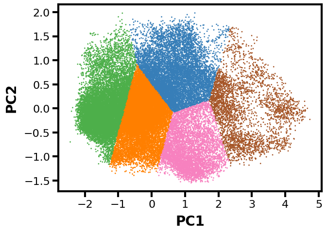
Example 5: Data Extraction for Machine Learning with scikit-learn
In this final example, I will go through how to extract data from a west.h5 file using wedap and then we can directly pass the data to other Python libraries such as scikit-learn to do some clustering and pca.
[35]:
from sklearn.cluster import KMeans
from sklearn.decomposition import PCA
from sklearn.preprocessing import StandardScaler
import numpy as np
[36]:
# load h5 file into pdist class
data = wedap.H5_Pdist("p53.h5", data_type="average")

# extract weights
weights = data.get_all_weights()

# extract data arrays (can be pcoord or any aux data name)
X = data.get_total_data_array("pcoord", 0)
Y = data.get_total_data_array("pcoord", 1)

# put X and Y together column wise
XY = np.hstack((X,Y))

# scale data
scaler = StandardScaler()
XY = scaler.fit_transform(XY)

# use 10x less data for easier plotting
XY = XY[::10,:]

# -ln(W/W(max)) weights
weights_expanded = -np.log(weights/np.max(weights))[::10]

# cluster pdist using weighted k-means
clust = KMeans(n_clusters=5).fit(XY, sample_weight=weights_expanded)

# create plot base
fig, ax = plt.subplots()

# get color labels
cmap = np.array(["#377eb8", "#ff7f00", "#4daf4a", "#f781bf", "#a65628"])
colors = [cmap[label] for label in clust.labels_.astype(int)]

# plot on PCs
pca = PCA(n_components=2)
PCs = pca.fit_transform(XY)
ax.scatter(PCs[:,0], PCs[:,1], c=colors, s=1)

# labels
ax.set_xlabel("PC1")
ax.set_ylabel("PC2")

plt.show()
[65]:
# save the resulting figure
fig.tight_layout()
fig.savefig("km_pca.pdf")
Now we have a plot along the first two principal components with cluster labels as the colors. Note that this isn’t necessarily the most rigorous example, but more of a demonstration of how to use wedap with a library like sklearn.